Portfolio Comparison: What made an SCBWI winner
Over the past three years that I’ve been pursuing children’s illustration, I have experienced what is likely normal for one new to the field; a lack of focus and direction in my work. When trying to find my voice, I’ve been scattered stylistically, drawing certain ways because I can, but not because I should. Since starting out, I have been working steadily at reining in my hand, and being much more intentional in the way that I draw.
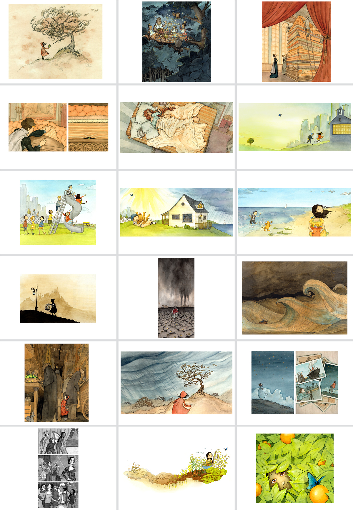
At last year’s SCBWI conference, I received the mentorship award, which allowed me to meet with six industry professionals and get a one-on-one portfolio consultation with each. Here are the images from my portfolio from that year, ordered from left to right:
In a nutshell, here’s the feedback I was given:
- the style is all over the place, with commercial work mixed with darker, literary work
- the literary work is stronger and more unique than the commercial work, yet it would be wise to keep both since it will be harder to make a living off the dark stuff
- put the two styles in separate sections in your book
- take out a number of pieces that feel out of place or are simply not as strong as the others
- consider drawing your characters with a classic, and less cartoony, approach.
Getting this kind of feedback was crucial at this stage in my journey. It was a privilege to hear from these professionals an affirmation of what I was doing right, and hear what needed to be improved. Sometimes when receiving criticism it’s important to hear what your critic is not saying. The gist of the feedback was, “Your darker, literary work is what we love, but the market needs brighter, commercial illustration.”
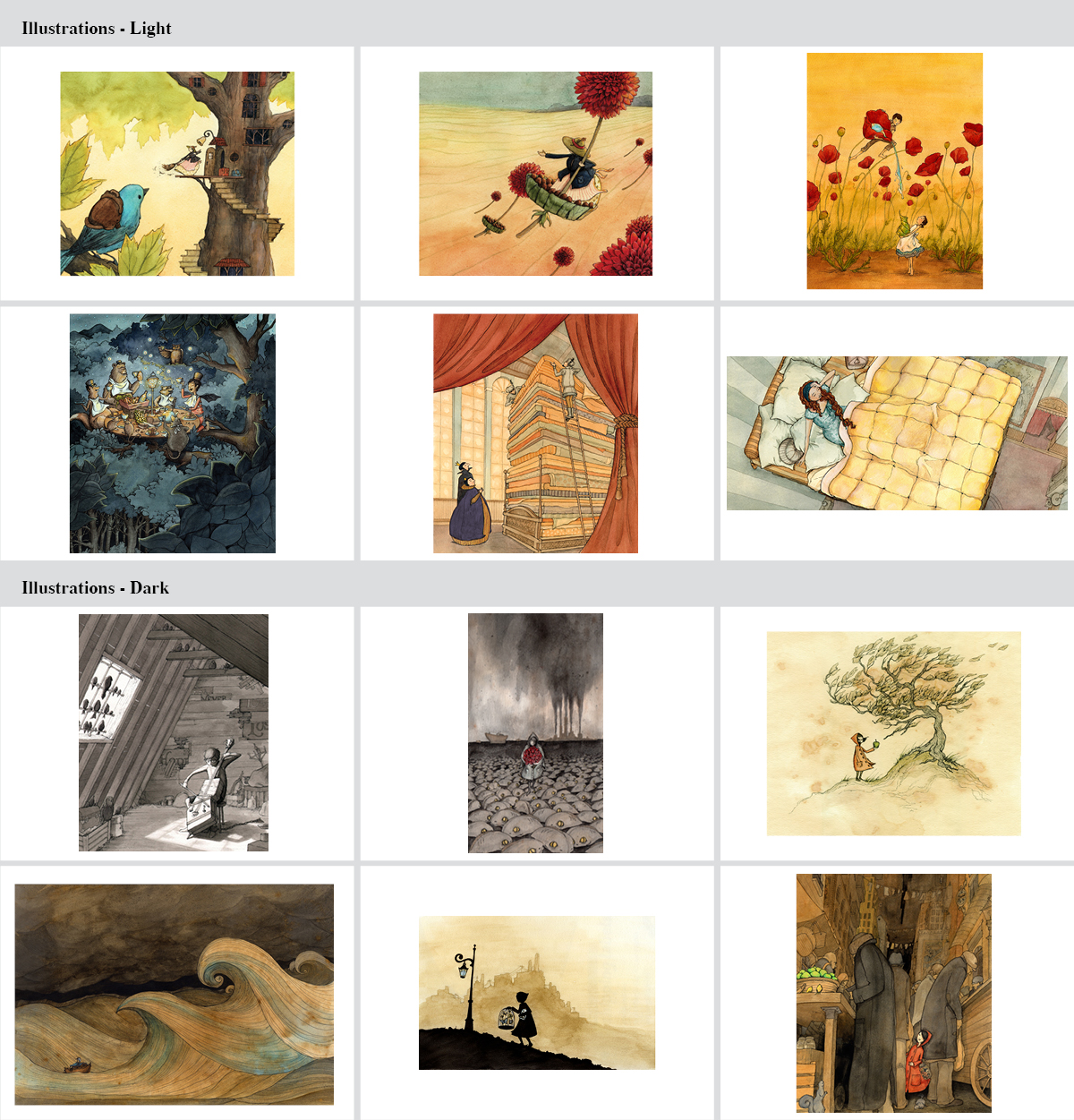
So instead of taking what I had and just separating them into two portfolios, I took out almost all my commercial work and revised a few. Then, I looked at what was working in my dark stuff and created new work that was stylistically similar, but happier in subject matter. The first three pieces in my new portfolio were born out of this process. Here’s my portfolio this year:
Important lesson: Don’t put a single piece in your book that you feel even the least bit iffy about.
Note that the new portfolio has less work than the old one (12 pieces vs. 17). Last year’s portfolio displayed a range of my ability, yet reflects a more scattered sense of the kind of work I do (simply because I was scattered in my understanding of what I should do). The mentorship program helped me gain that focus towards one cohesive look and, even with two styles, I feel the new portfolio has achieved that unity.
My thanks go out to SCBWI for creating this mentorship program, and to the judges of this year’s showcase (Laurent Linn, Steven Malk, Richard Jesse Watson, Nancy Conescu and Jamie Weiss Chilton) for choosing my work out of such a big pool of talented illustrators. Most of all I thank my mentors (Pat Cummings, Cecilia Yung, Priscilla Burris, Bridget Strevens-Marzo, David Diaz, and Rubin Pfeffer), who shared their advice so openly and generously. I owe my win at this year’s Portfolio Showcase to them!
If you have any comments to add or follow-up questions about specifics I might not have covered, I would love to hear them. Thanks for your interest!
~Eliza


