Portfolio Comparison, Part 2: Book Design
I recently posted a Before and After look at my portfolio, showing changes that I made from last year to this year. One aspect that I did not include were changes that I made to the actual book design of my portfolio, which I’ll share here.
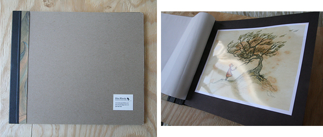
I have a particular love of bookmaking, and since I also love to customize things, I decided to make my portfolio rather than buy a standard one. It’s important to say that using a store-bought portfolio is perfectly fine, and usually it’s better than getting overly craftsy. In the case of my last year’s portfolio, it would have been better for me to use a standard book than make it from scratch the way I did. Here it is:
So what was wrong with it? It’s basically form without function.
- The materials were flimsy – I used a mat backing for the cover that was too thin and nicked easily on the edges.
- The details on the cover were fragile, like the paper pattern along the binding and the name label – these additions made with separate pieces of paper could easily get caught and rip off. You don’t want the person looking through your portfolio feeling afraid to damage it.
- For the interior pages, I adhered photo printouts of my work onto black paper. Although the prints looked nice, the double-layered pages felt bulky, and when the pages were bent over and turned, the photo paper bubbled awkwardly on the page.
- It was a bad combination of being too big (about 14×12″) for the flimsy design.
This year I redesigned the book with those lessons in mind:
The changes that I made include:
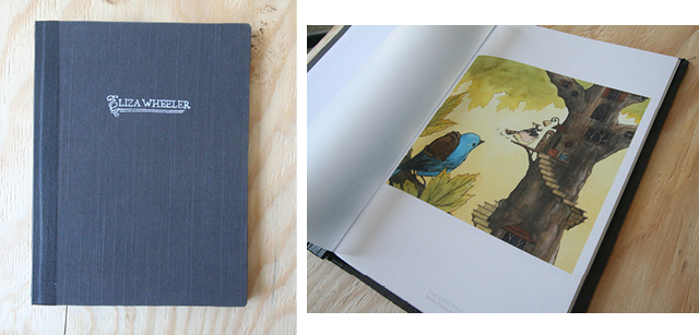
- Making the portfolio a smaller size (9×12), with letter-size paper. Some of my artwork is long and horizontal, so I bought double-sided mat paper (from Epson, to print on my Epson Stylus Photo 2880) in order to print the spread just as it would appear in a book, with the fold in the middle.
- Making a sturdy cover, using fabric over thick mat board. I printed my name right onto the fabric with fabric paint, applied with a carved rubber stamp.
- For the interior pages, I printed right on the paper instead of adhering a separate image onto the paper
- Keeping the design simple, while still being customized and unique
Also, according to the advice from my mentors to separate my portfolio into two styles, I preceded both sections with a piece of translucent vellum, printed with the titles “Illustrations: Light” and “Illustrations: Dark”
Why is it important to have a physical portfolio? It’s not, really. But there are a few cases where you’ll need one, which is when you go to conferences (like the ones put on by SCBWI), and also if you go to New York to do portfolio drop offs for art directors, or meet with publishers. This has become less common with the ability to put your portfolio on a website. But I’ve heard some illustrators advocate the trip to New York because, since it IS less common, it helps you stand apart from the crowd of online portfolios. Meeting with editors, agents, and art directors face-to-face is always a plus.
Thanks for reading!


