
Making the ‘ROSA’ Art: Colors
Another ‘Behind-the-scenes’ peak into the art-making process for ‘What Rosa Brought’, and one of my favorite stages of book design – creating the color palette. I could spend a year painting nothing but color swatches!
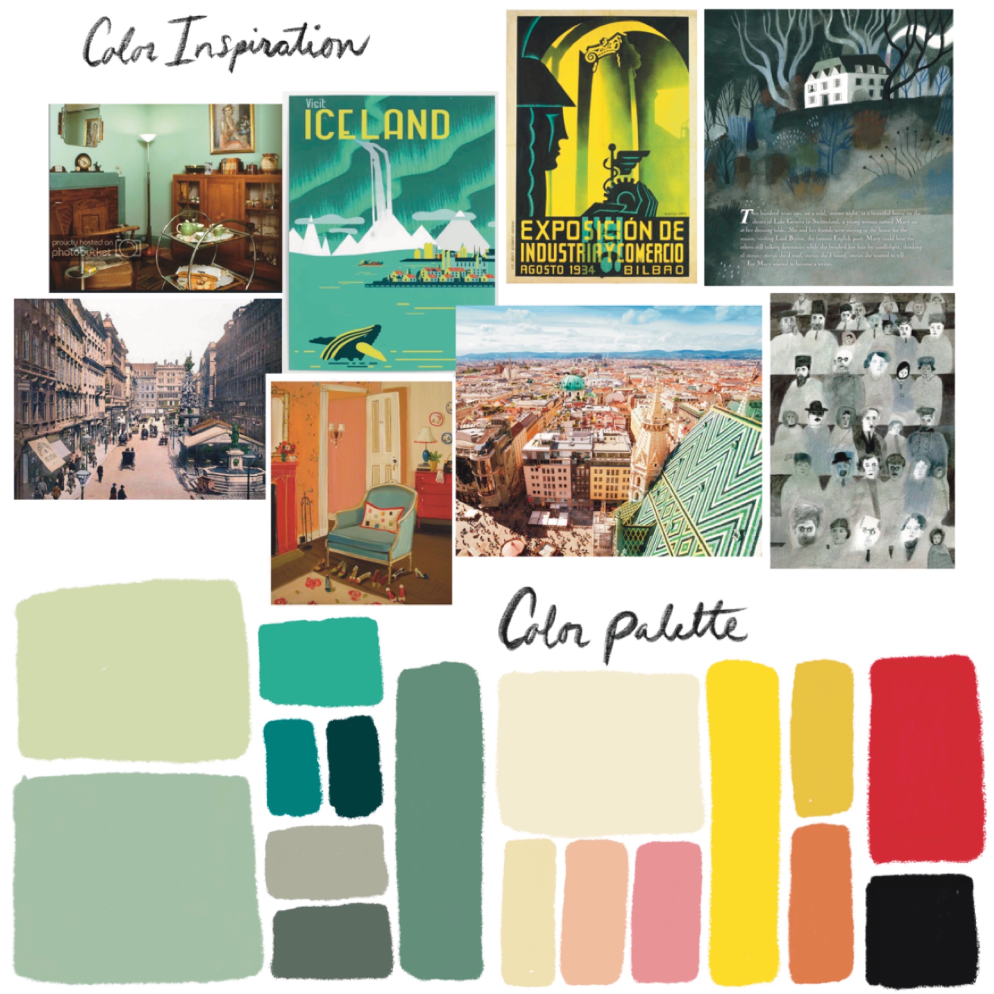
The first step to inspiring the colors was to draw from historic photos, 1930’s art, photos of Vienna, and other book artists color palettes that I loved (shown: Felicita Sala, Janet Hill, Laura Carlin). I start digitally in Procreate.
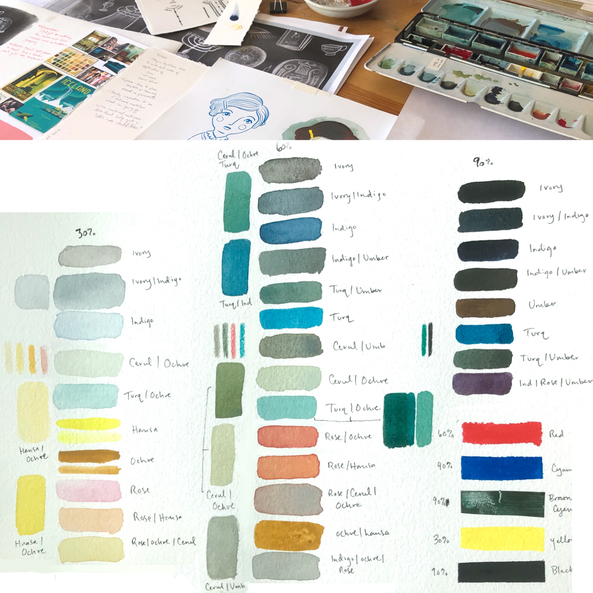
Then the fun part…finding the hues in watercolor, honing in on which tubes of pain I’ll use and how they mix together. I separate these into light, medium, and dark hues.
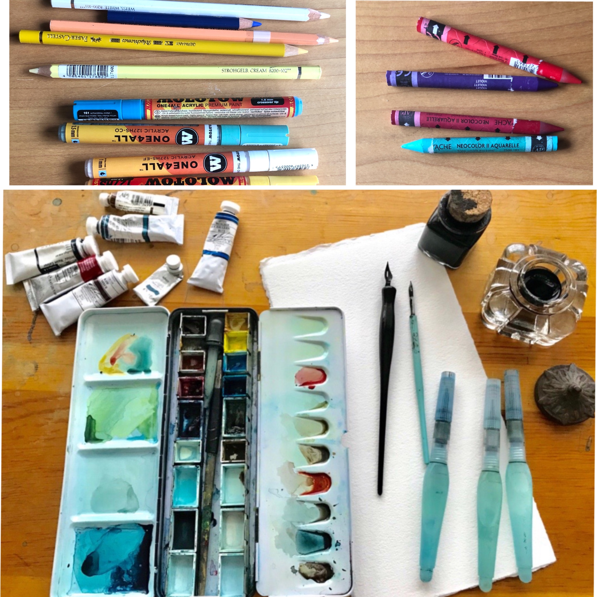
Materials used for this book: M.Graham watercolors, India ink, various colored pencils, block printing ink (not shown), Molotow acrylic paint pens, and Caran’ache wax crayons, all painted on Lanaquarelle 300lb watercolor paper.
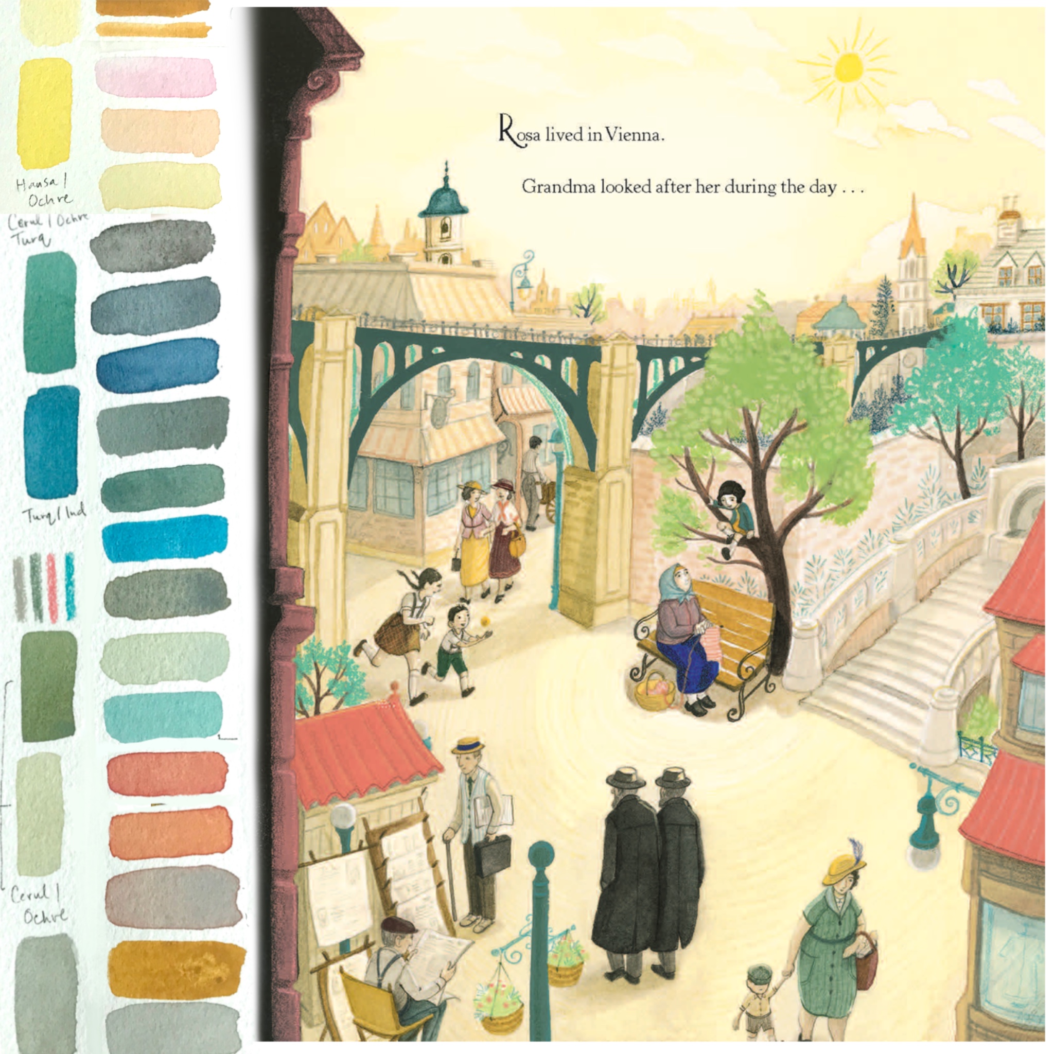
The beginning of the story begins with a mix of happy hues; yellows, peaches, pinks, greens and blues.
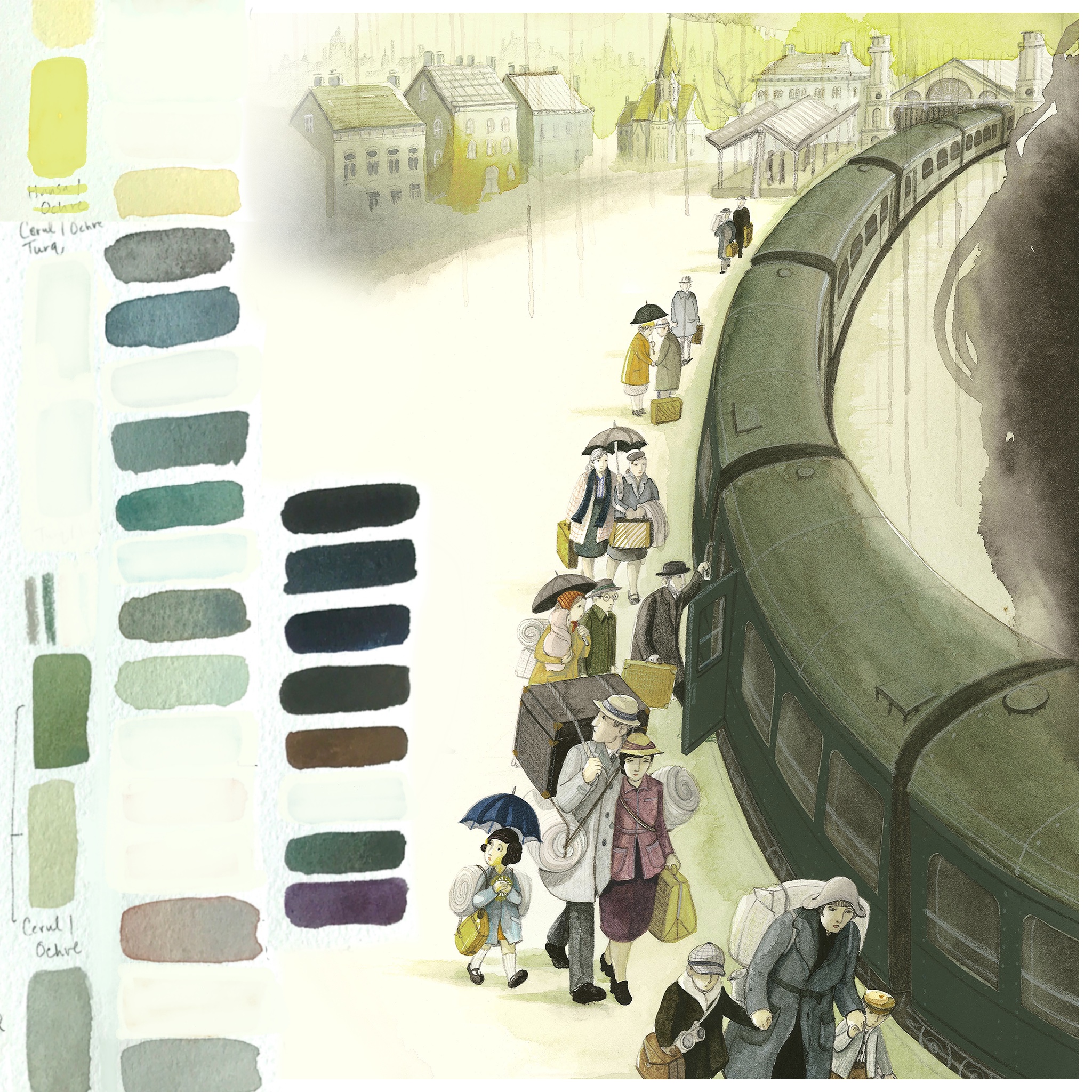
After the Nazi’s invade, the warm pinks and yellows drain from the environments of the pages, leaving a palette of mostly neutrals and greens. Though, you’ll notice in other scenes of the book that I leave the color in the costumes and home interior of Rosa’s family, to show that their culture is not being erased.
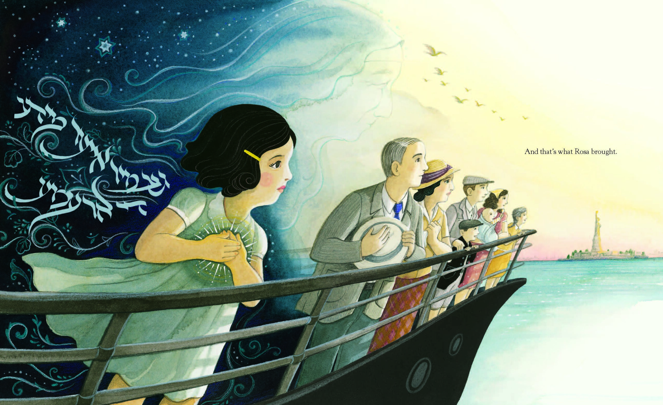
When we reach the final spread, new pinks and yellows creep back in, with the hope of a new life in a new country.
